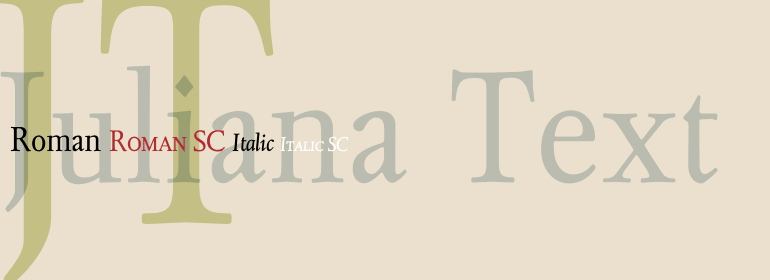
Juliana® Text
If a man is proud of his wealth, he should not be praised until it is known how he employs it.
字体介绍:
Juliana is a face of traditional style yet entirely original. Designed by Sem Hartz in 1958. Juliana Text is the digital revival of this version. This was now digitized by Sam Berlow. Juliana shows lots of detail that it is an original design, though reminiscent of the handsome type faces produced in Italy in the first part of the sixteenth century. The capitals are partly 'classic' in style, with very few outstanding features (which is all the good). The K and R have flowing terminals; the S is comparatively level at head and foot; the U has arms of equal weight; the W is crossed in traditional fashion. The capitals are probably slightly less tall than the ascending lowercase letters. The lowercase has no eccentricities; its forms are different from other faces only in small detail. The b has a serif at the foot but no crotch; k has the sample style of terminal as the capital; the i and j have diamond shaped dots (the full point in Juliana is of the same design). The arches of h, m and n are comparatively flat. The lowercase w differs from the capital; it is not crossed. The important thing to note is that the designer has not attempted to create a new design by making the letter noticable; he has achieved his object by allowing his own innate understanding of the Roman letters to express itself with restraint and dignity.









 商业发布授权
 出版物授权:针对出版物
 嵌入式应用授权


