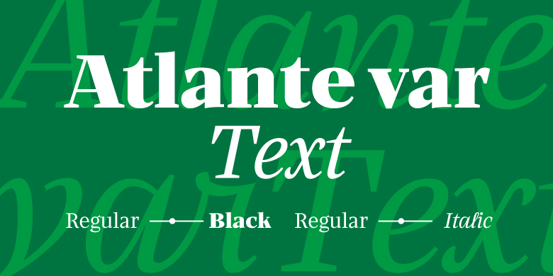
Atlante var Text
字体介绍:
The first thing likely noticed is the sharpness and precision of Atlante’s forms, which makes sense, as it originally stemmed from the idea of an italic-only family. Care was taken with the extreme weights and delicate contrast to maintain its sophistication in pixel and on paper.
The entire family feels comfortingly familiar while being a fresh take on a text and display companion. The text styles are straightforward and slightly blunted to hold up well in small sizes. And if you want to see it transition with modern technology right in front of your eyes, opt for the variable font instead of the OTF.









 商业发布授权
 出版物授权:针对出版物
 嵌入式应用授权


