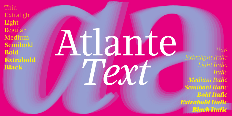
Atlante Text
字体介绍:
The first thing likely noticed is the sharpness and precision of Atlante’s forms, which makes sense, as it originally stemmed from the idea of an italic-only family. Care was taken with the extreme weights and delicate contrast to maintain its sophistication in pixel and on paper.
The entire family feels comfortingly familiar while being a fresh take on a text and display companion. The text styles are straightforward and slightly blunted to hold up well in small sizes.






 商业发布授权
 出版物授权:针对出版物
 嵌入式应用授权


