Ways
字体介绍:
视觉补偿、额外的空白、更宽的顶点、细微的调整和适度的墨水陷阱在类似的字体中脱颖而出。使用690多个象形文字、扩展的拉丁语和西里尔文支持、广泛的OT功能集、60多个导航象形文字的图标集和一种可变风格,设计完整的标牌系统,让您在不依赖G地图的情况下从A点到达B点。
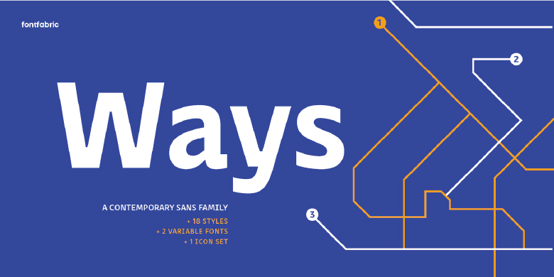
Born at a crossroads, the collaborative sans family of 18 styles Ways is the latest arrival in our portfolio. The name is no coincidence, as Ways pulls out all the stops to bring you excellent legibility. Combined with brutal and elegant details for a distinct humanist flair, this sans offers perfect functionality across all weights.
Visual compensations, extra white space, wider apexes, subtle tweaks, and moderate ink traps distinguish Ways among similar typefaces. Use over 690 glyphs, extended Latin and Cyrillic support, extensive OT features set, icon set of more than 60 navigation pictograms, and one variable style, to design full-fledged signage systems that get you from point A to point B without relying on G-Maps.
Family overview:
• 9 weights (from Thin to Black) + italics
• Extended Latin
• Cyrillic
• 690+ glyphs
• languages
• 1 variable font (2 axes)
• 1 free font – Ways SemiBold
OpenType Features
Common Ligatures
Contextual alternates
Localised Forms
Tabular Figures
Diagonal Fractions
Denominator
Numerator
Subscript
Superscripts
Case Sensitive Forms
Ordinals










 商业发布授权
 出版物授权:针对出版物
 嵌入式应用授权


