Guzzo™
字体介绍:
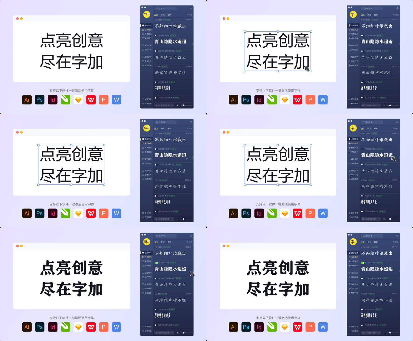
从将其应用在较大标题中的紧凑字重样式或在紧凑范围内的密集文本,到试验于扩展空间的小尺寸、标签或包装,广泛的重量和风格可以适用于任何设计空间。不止如此,Guzzo 真正的魅力可能是通过其奇妙俏皮的形状来表达的,其不寻常的“aid-back italics”具有草书形式和向后倾斜的效果。不同的风格设置允许你来决定你如何使用 Guzzo ,选择不同种类交替的字形可以将它引导到你想应用的任何方向。
Guzzo家族的某些字体就像是一个快乐又幸运的角色,也具有温暖、谦逊和艺术的特质。一眼看去,可能无法识别为一种字体,它几乎可以被当作手写体。 Guzzo 可以很好的与手稿和平面字体搭配,应用在玩具、包装、菜单、广播、卡通和商品推销中效果最好! Guzzo 可以帮助您展示一种糊涂感,它适合想要展示手绘和休闲图案风格的设计师。
它的名字来自美国艺术家 Jeremy Pinc,又名 painter Guzzo Pinc,该字体体现了他的画作的古怪、有趣和心碎的特质——就如古怪的人物、松散的几何形状和鲜艳的色彩一般。
对这款中世纪、真实、怀旧风格的字体来说——它的故事取决于你
A playful caricature of a midcentury grotesque, Guzzo is a fresh addition to the Monotype Library. Somewhat eccentric and full of surprises, its unmistakable quirk can be found on closer inspection, stemming from details proudly borrowed from brush lettering and calligraphy. The wide range of weights and style can take you through any design space, from the condensed weights squeezing in larger headlines or dense blocks of text with the condensed range, to experimenting with small point sizes, labels or packaging with the extended cut. However, Guzzo’s real charm is probably best expressed through its wonderfully playful shapes, its unusual 'laid-back italics' feature cursive forms and a backslant. The different stylistic sets allow you to decide what you make of Guzzo, with several sets of alternate glyphs steering it in any direction you want.
Guzzo is a happy-go-lucky character, and has a warm, humble and painterly quality that - at a glance - may be unrecognizable as a typeface. It can almost pass for hand-lettering. Guzzo pairs exceptionally well with scripts and slab typefaces, and feels most at home in situ with toys, packaging, menus, broadcasting, cartoons and merchandising! Guzzo encourages you to turn up the silliness and is for designers who want to emulate hand-painted and casual motifs. Taking its name from American artist Jeremy Pinc, aka the painter Guzzo Pinc, the typeface channels the quirky, funny and poignant qualities of his paintings - with wacky characters, loosely painted geometric forms and bright colors.
For this mid century, authentic, nostalgic typeface - the story is really what you make of it.








 商业发布授权
 出版物授权:针对出版物
 嵌入式应用授权


