Tellumo™
字体介绍:
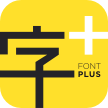
它的比例适中,笔划对比度低,开放,合适的x-hight使其在运行文本时轻松驾驶。六种重量的适用范围,从thin到extrabold,使其具有多功能性。最轻和最重可应用在标题和副标题中,增加视觉冲击、突出短标题,使其在包装设计中脱颖而出。
Tellumo以世纪中期的现代艺术和装饰艺术美学为灵感。它看起来精确、整洁,适合建筑和家居用品。干净、清新、现代,既美观又健康,又优雅、平易近人,适合时尚。它具有清晰性和个性的平衡,适用于各种品牌和广告,印刷品和数字设计。
Telumo从其几何基础上散发出温暖、魅力和欢乐。
Tellumo, a new humanist geometric sans serif typeface, has all the attributes you need for a workhorse sans with a few surprising details.
It has moderate proportions, a low stroke contrast, open apertures, and an x-height that makes it drive with ease in running text. A modest range of six weights, from Thin to ExtraBold, make it versatile without being overwhelming. The lightest and heaviest weights are best saved for headlines and subheads. It features a set of swash caps that can add magnitude and sparkle to short headlines, making it excel in packaging designs.
Tellumo feels at home with Mid-century Modern and Art Deco aesthetics. It looks precise, tidy, and welcoming for architecture and home goods. It looks clean, fresh and modern for beauty and wellness, or elegant and approachable for fashion. It has a balance of clarity and personality, suitable for branding and advertising of all kinds, print & digital design alike.
Tellumo radiates warmth, charm, and joyfulness from its geometric foundation.









 商业发布授权
 出版物授权:针对出版物
 嵌入式应用授权


