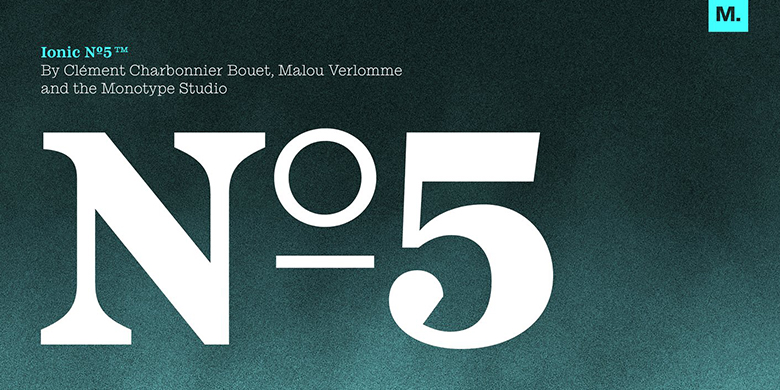
Ionic No 5™
字体介绍:
因为这些风格在书籍和报纸上流行了很长时间,我们把它们与编辑或书生气联系在一起,不是枯燥乏味,而是深思熟虑。今天的设计师可以利用这种关联作为视觉捷径,传达相似的含义和语调。更多的修改放在了字体的现代化上,引入了锐利的边缘和修饰。
最薄的重量可以给舞动的打字机带来美感,即低笔划对比度。总的来说,Ionic No5 字体丰富,可以让每一款字重都成为一张海报。
Ionic No5 is a refresh of a classic Linotype Clarendon-style serif, another restored classic from the Monotype library, much like the recent updates to Walbaum and Helvetica Now. The original typeface was designed to be printed and read at small sizes, popular with newspapers in the 20th Century at its birth. The restoration and refinement of this typeface has bestowed a greater sense of clarity and directness, smartly stylish, and an utterly captivating appeal.
Because these styles were so popular for books and newspapers for so long we associate them with being editorial or bookish, not dull, but thoughtful. Designers today can use that association to their advantage as a visual shortcut to convey similar meaning and tone. More attention was given on modernising the typeface with precious use and the introduction of sharp edges & finishes.
The thinnest weights can give a dancing typewriter aesthetic, being low stroke contrast. The heavy weights have an unquestionable presence on the page. Overall, the typeface has a richness and almost illustrative quality about it. The true depth of Ionic No.5 could enable each weight to be a poster by itself.


 商业发布授权
 出版物授权:针对出版物
 嵌入式应用授权


