Adelle Mono
I would prefer as friend a good man ignorant than one more clever who is evil too.
字体介绍:
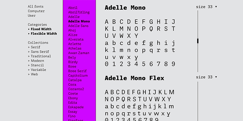
使用价值高于单纯的审美价值是等宽字体的设计的出发点。每个字符轮廓都被严格局限于等宽的框中,本身较窄的字要与本身较宽的字设计的宽度相同。虽然这样做可以保持文本在横向和纵向完全对齐,但就可读性而言,这并不自然。等宽的l和i必须要过度的加宽,m和w需要进行压缩。因此,Adelle Mono字体家族的设计既考虑到开发人员,也考虑到了审美。 Adelle Mono在必要的限制条件下,仍然具有视觉吸引力和易读性。让它变成Sublime,Swift,Terminal或者你IDE中的选择,然后看它表现如何。它良好的识别性的会减少开发人员的错误,它的美感会让工作更加愉悦。
Adelle Mono Flex是一个成比例变宽的版本,适用于任何类型的普通文本阅读,以及致力于“系统或信息美学”的设计中。与等宽字体家族的需求相反,Flex是一款针对读者的产品,主要用于品牌、年度报告、短文、UI、logo、海报、屏幕、表格和标题等等。Mono版本用于需要等宽字体的语境,Flex版本用于需要阅读性和连贯性的语境。
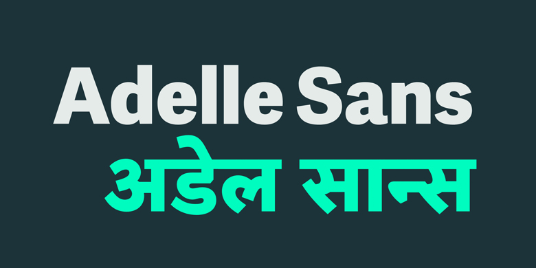
Adelle Mono包含具有实验性质的20种风格的设计,探索了比例与等宽字体之间的空间。它通过在同一系列中提供灵活的选择来增强创造力和连贯性,包括意大利斜体和可以在多宽度和等宽字体之间使用的可变字体。将Adelle Mono与Adelle或Adelle Sans结合使用,可以为您的工作增加更多层次和更大的适应能力。
可变字体是OpenType技术的一个新部分,字体设计者设计字体,用户可以更个性化的组织和使用字体,比过去先进。
可变字体不是每个字体都有一个单独的字体文件(比如extralight,regular,bold或者extrabold),而是在一个字体文件中,有一个包含了无限选择的“设计空间”,这个设计空间涵盖了极值状态之间的所有可能性。
The Adelle family continues its stylistic expansion with the release of Adelle Mono and Adelle Mono Flex by Veronika Burian and José Scaglione. Monospaced typefaces are the default choice for developers and programmers and are also an aesthetic choice for many designers and communicators. The Adelle Mono font family has two widths to serve both breeds and a variable font for the flexible spectrum in between.
Monospaced typefaces are born of necessity rather than purely aesthetic values. Each glyph is constrained to a strict box, making the naturally smaller ones the same width as the naturally wider ones. While this serves the functional purpose of keeping text aligned in vertical and horizontal rows, it is completely unnatural in terms of readability. A monospaced ‘l, i’ are overblown compromises while ‘m, w’ become compressed mutations. The Adelle Mono family was therefore designed with both the developer and the aesthete in mind.
Adelle Mono respects its necessary constraints while still being visually appealing and easily read. Activate it for use in Sublime, Swift, Terminal, or your IDE of choice and see how well it performs. Clarity will lead to less developer mistakes, and its aesthetic appeal will make your work enjoyable.
Adelle Mono Flex is the proportional width version that works for any kind of normal text reading or a design intended to invoke “system or information aesthetics”. Opposite the demands of the monospace family, Flex is reader friendly and intended for brand- ing, annual reports, paragraphs, UI, logos, posters, screens, tables, captions, and more. Employ the Mono version where monospace is needed and the Flex version where reading or coherence is priority.
Adelle Mono’s experimental 20-style design explores the space between proportional and mono- spaced types. It boosts creativity and coherence by providing flexible options in the same family, includ- ing italics and the variable font format with an axis of weight and a spectrum axis between multi-width and monospaced characters. Combining Adelle Mono with either Adelle or Adelle Sans adds more layers and adaptability to your work.
Variable fonts are a new part of OpenType technology that allows typeface creators to design fonts, and users to organise and use them, in a more advanced way than was done in the past. Rather than having one individual font style per font file (i.e., extralight, regular, bold, or extrabold), variable fonts are one file with almost infinite choices within a single “designspace”, the total boundaries for a typeface’s appearance.






 商业发布授权
 出版物授权:针对出版物
 嵌入式应用授权


