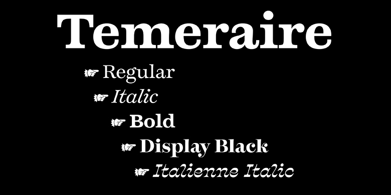
Temeraire
Why, I'd like nothing better than to achieve some bold adventure, worthy of our trip.
字体介绍:
Most ty大多数的家族去增加每个字体的字重来扩充家族。不同的是,在18世纪对起源的研究产生了Temeraire广泛的字母形式,从可预测的到随时间变化而古怪的或松散的。 每种字体样式都旨在与其他样式配合使用,但它们也是对英语字母传统的特定部分的独立敬意:碑石切割,书写大师的手写体,意大利雕刻等。
Temeraire的常规风格是带有对比鲜明的垂直应力的过渡衬线体,非常适合时代和经典作品,讽刺作品和现代装饰。 每个字形的末端均以粗体加粗,以确保稳定性,斜体字型则如出一辙:流畅,对比鲜明且有目的地不一致。Temeraire的Display Black字型是一种富有表现力的墓碑艺术。 最容易注意到的细节是“ g”,其下降字碗在中央被向上压,以及“ t”横线上的附加衬线,该横线将其相邻字符隔开。 (“ g”和“ Q”也具有无环状的备用体。)
最后的风格是意大利斜体,横向凸显了在家庭的位置。 通过设计,其特征的流动和弯曲方式与家庭其他成员不同步。 所有的字重都被推到每个字形中的任一半球上,从而导致显示样式需要围绕它的空间和平和度,以便其存在可以令人印象深刻。
像所有TypeTogether类型的家族一样,Temeraire的五种风格满足了当前设计师的需求,包括当默认设置太夸张时的替换体。对于这位大胆的设计师来说,它在屏幕上的效果很好,但在印刷品上更为闪耀。Temeraire serif字体家族在《岁月的回声》中复活,并通过完美的品味找到了它的家族关系。
Quentin Schmerber’s Temeraire serif font family was not designed to be invisible. It is a typographic exploration meant to be seen — with its beauty, one could even say beheld. While some fonts aim to be as easily ignored as possible, Temeraire is offered as a gift to wide-eyed readers with its anything-but-boring character and its conspicuous inconsistency in styles.
Most type families increase the weight of each character to expand the family. Instead, research into 18th century sources produced Temeraire’s wide range of letterforms, from the predictable to the odd and loosely related through time. Each style is designed to work alongside the others but are also standalone homages to specific parts of English lettering tradition: gravestone cutting, writing masters’ copperplates, Italiennes, and others.
Temeraire’s Regular style is a contrast-loving Transitional Serif with vertical stress, making it great for period and classic works, ironic pieces, and modern throwbacks. The weight of the Bold squares off the ends of each glyph to give it stability, and the Italic style rings true: flowing,contrasting, and purposefully inconsistent.Temeraire’s Display Black style is one salvaged from expressive gravestone artistry. The details most easily noticed are the ‘g’ with its descending bowl that has been pressed back up in the centre, and the additional serif on the ‘t’ crossbar that holds its neighbouring character at bay. (The ‘g’ and ‘Q’ also have loopless alternates.)
The final style is the Italienne Italic, the horizontally stressed counterpoint to the family. By design its characters flow and bend in ways not in step with the rest of the family. All the weight has been pushed to either hemisphere within each glyph, resulting in a display style that demands space and peacefulness around it so its presence can impress.
Like all TypeTogether families, Temeraire’s five styles meet the current designer’s needs, including alternates for when the defaults are too boisterous. It works on screens for the audacious designer but truly shines in print. The Temeraire serif font family is resurrected from echoes in time and finds its family relation through impeccable taste.





 商业发布授权
 出版物授权:针对出版物
 嵌入式应用授权


