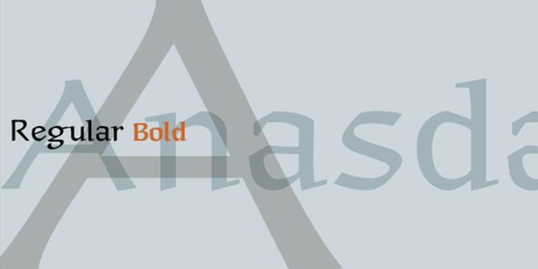
Anasdair™
A wise doctor does not mutter incantations over a sore that needs the knife.
字体介绍:
Anasdair是由英国设计师Richard Yeend创建,类似于Herbert Post教授的Post Antiqua和Renate Weise的Scriptuale家族。
Anasdair在正式应用中看起来很棒,在证书或邀请上可能特别有用。 Anasdair家族的所有四种字体,包括其两个粗细和它们的替代字体,都是Linotype Libarary的Take Type 5集合的一部分。”
Anasdair is a semi-serif text face that maintains its calligraphic origins. Its wide uppercase characters display an even, mono-spaced appearance. The design of the lowercase letters couples this rhythm with large apertures and tall x-heights. Anasdair's sharp, pen-formed details are recognizable even in small point sizes, and they help lead the eye through the letters' curves-bringing the reader's eye across the line of the page. Both Anasdair Regular and Anasdair Bold have supplementary Alternate fonts available. These Alternate fonts contain extra ligature pairs not found in the standard character set (e.g., ffi, ft, and tt), as well as alternative characters, such as a second capital I, and a long s. Anasdair was created by the British designer Richard Yeend, and is similar to Prof. Herbert Post's Post Antiqua, and Renate Weise's extensive Scriptuale family. Anasdair looks great in formal applications, and may be particularly useful on certificates or invitations.
All four fonts in the Anasdair family, including its two weights, and their alternate sets, are part of the Linotype Libarary's Take Type 5 collection."












 商业发布授权
 出版物授权:针对出版物
 嵌入式应用授权


