Boogie™
Life contains but two tragedies. One is not to get your heart’s desire; the other is to get it.
字体介绍:
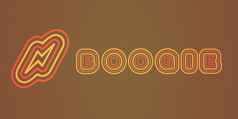
Boogie在大标题、显示和标识应用中表现最好,在这些应用中,可以清楚地看到和欣赏它的形式。当应用不同的彩色图层时,在Boogie中设置的文本将在页面上旋转并跳动!
Weissmantel曾担任多家国际广告公司的艺术总监,并领导过Grey和MetaDesign等公司的企业设计项目。他的设计作品获得了国际荣誉,被收录在汉堡艺术与贸易博物馆的排印收藏中。他目前在Düsseldorf University of Applied Sciences教授平面设计。Weissmantel自2002年8月以来一直是United Designers Network的合伙人。
在2003年由Linotype GmbH主办的国际字体设计大赛中,Boogie获得了荣誉奖。
German graphic designer Ralf Weissmantel created Boogie in 2003. Boogie is an ironic reference to pop art, and to disco lettering from the 1960s and 70s. Its round forms and outlines evoke the flashing, pulsating lights and music of that era. Shipping with five different, width-compatible fonts, the Boogie typeface has four different components: an outlined letterform is the base element, and forms the first font. Three additional fonts may be layered over top of this base, surrounding the first font with up to three bubble-outlines. In graphics applications like Adobe PhotoShop or Illustrator, these elements can each be assigned different colors. There is also a fifth font, which contains the base outlined letterform pre-surrounded by three additional outlines of the same color.
Boogie works best in large headline, display and signage applications, where its forms can be clearly seen and enjoyed. When different colored layers are applied, text set in Boogie will gyrate and jive across the page!
Weissmantel has worked as an art director for various international advertising agencies, and has led Corporate Design projects for firms such as Grey and MetaDesign. His design work, honored internationally, has been included in the typography collection of the Museum for Art and Trade in Hamburg. He is currently teaching graphic design at the Düsseldorf University of Applied Sciences. Weissmantel has been an associate of the United Designers Network since August 2002.
Boogie received an Honorable Mention in the 2003 International Type Design Contest, sponsored by Linotype GmbH.















 商业发布授权
 出版物授权:针对出版物
 嵌入式应用授权


