Airam™
I willingly speak to those who know, but for those who do not know I forget.
字体介绍:
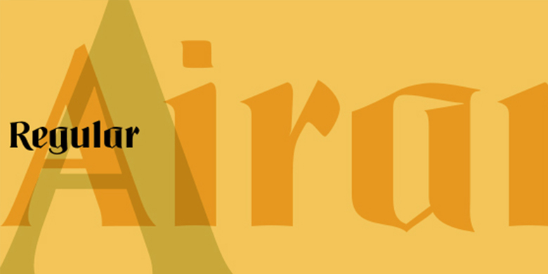
Airam于2002年由奥地利设计师Maria Martina Schmidt设计,并被Linotype GmbH收录在Take Type 5家族中。
Airam blends contemporary legibility with historic blackletter forms, creating a contemporary text face that speaks to the old European past. The term blackletter refers to a style of typefaces that evolved out of Northern Europe's medieval manuscript tradition. Often called gothic, or Old English, these letters are identified by the traces of the wide-nib pen stroke within their forms. Typefaces designed in this style normally exhibit a drastic thick-thin stroke contrast. They tend to be set a bit narrow, leaving the appearance of a black tone across the page. The strokes of these letterforms also appear quite broken" in nature (indeed, the German term for blackletter - gebrochene Schriften - literally means broken letters). To fit the bill, when set on a page, Airam certainly appears darker than most other contemporary text faces. Airam's letterforms are slightly broken, too. They display angled joints in lieu of smooth curves. This "broken" aspect actually aids legibility at smaller point sizes. While Airam may not be suitable for setting whole books or newspapers, this font will add a splendid touch to short tracts of small text. Additionally, Airam looks superb in large headlines. Airam was designed in 2002 by the Austrian designer Maria Martina Schmidt, and is included in the Take Type 5 collection from Linotype GmbH."











 商业发布授权
 出版物授权:针对出版物
 嵌入式应用授权


