Anlinear™
A wise doctor does not mutter incantations over a sore that needs the knife.
字体介绍:
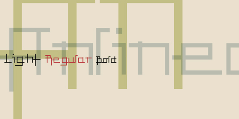
Anlinear is part of a series of constructed typographic experiments from the young Swiss designer Michael Parson. In the Anlinear family, which contains three separate weights, Parson has successfully created a fabulous display of alphabets out of the sole arrangement of lines at right angles to each other. The letters in this face virtually groove with the beat as you set them in text. Like a musical score, they provide a fantastic look just right for your next flyer. This family of fonts looks best when set in larger point sizes, in headlines or other display settings. Anlinear and nine other Michael Parson designs are featured in the Take Type 5 collection from Linotype GmbH."


 商业发布授权
 出版物授权:针对出版物
 嵌入式应用授权


