Zapf Renaissance Antiqua™
Why, I'd like nothing better than to achieve some bold adventure, worthy of our trip.
字体介绍:
关于某些个别样式的注释:
1. Zapf Renaissance Antiqua是对Palatino家族的全新诠释(最初由赫尔曼·扎夫(Hermann Zapf)为法兰克福D. Stempel AG及Linotype于1948年设计)。
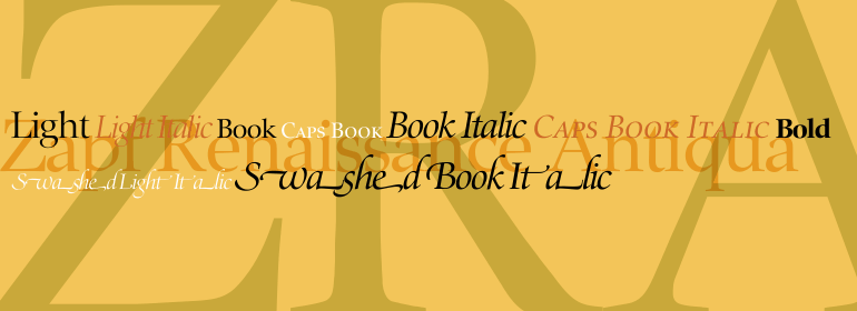
2. Zapf Renaissance Antiqua Swashed Light Italic和Zapf Renaissance Antiqua Swashed Book Italic是带有更多额外字符,连字和fleurons的书法斜体。这些可以与标准的Zapf Renaissance Antiqua Light Italic 和 Zapf Renaissance Antiqua Book Italic结合使用。
3.Zapf Renaissance Antiqua 有Light和Book字重; Zapf Renaissance Antiqua Light更适合显示目的,而Zapf Renaissance Antiqua Book已针对小尺寸文字进行了优化。
4.只有Zapf Renaissance Antiqua Book有配套的小型大写字母字体。”
The Zapf Renaissance Antiqua type family was designed by Hermann Zapf for the German Scangraphic Dr. Böger GmbH in Hamburg, from 1984-1986. The typefaces were engineered for use in digital CRT phototypesetting.
Notes on some of the individual styles:1. Zapf Renaissance Antiqua is a new interpretation of the Palatino family (originally designed by Hermann Zapf for the D. Stempel AG in Frankfurt and for Linotype, from1948 onward).
2. Zapf Renaissance Antiqua Swashed Light Italic and Zapf Renaissance Antiqua Swashed Book Italic are more calligraphic italics with many extra characters, ligatures, and fleurons. These may be used in combination with the standard Zapf Renaissance Antiqua Light Italic and Zapf Renaissance Antiqua Book Italic.
3. Zapf Renaissance Antiqua has both Light and Book weights; Zapf Renaissance Antiqua Light is more optimal for display purposes, where as Zapf Renaissance Antiqua Book is optimized for small text sizes.
4. Only Zapf Renaissance Antiqua Book has a companion Small Caps font."










 商业发布授权
 出版物授权:针对出版物
 嵌入式应用授权


