Parisian™
I love the sensual. For me this and love for the sun has a share in brilliance and beauty
字体介绍:
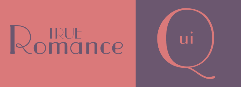
Parisian字体在粗笔画和细笔画之间形成鲜明的对比,而小写字母则具有较小的x高度和非常高的上升。 自推出以来,巴黎精致优雅的装饰艺术风格使其在文具打印机以及其他偶尔和显示应用中非常受欢迎。
在粗细笔画之间有强烈的对比,小写字母有一个小的x高度和非常高的升部。自发布以来,巴黎简约优雅的装饰艺术风格使其非常受欢迎的文具打印机和其他偶尔和显示应用。
Parisian font was designed by Morris Fuller Benton in 1928 for American Type Founders and is similar to Broadway, another M.F. Benton design from 1928.
Parisian font has sharp contrast between thick and thin strokes, and the lowercase letters have a small x-height and very tall ascenders. Since its release, Parisian's lean and elegant Art Deco style has made it very popular for stationery printers and for other occasional and display applications.





 商业发布授权
 出版物授权:针对出版物
 嵌入式应用授权


