


品 牌:

设 计 师:
Frutiger,Adrian
分 类:
符号
字体属性:
外文
字体编码:
Unicode
标 签:
字体介绍:
Adrian Frutiger创建了整个字体世界。他尤以其适用于较长文本的高度可读性字体(Meridien、Univers、Glypha,Linotype Centennial等)而闻名,而且他还创作了许多流行的装饰性字母,如Ondine、Phoebus以及President,这些都是他于1953年在巴黎创作的。
最近,他将自己的技能运用到了Linotype 的项目Type Before Gutenberg中。这其中包括轻盈且精美的Herculanum,带有菱形衬线的窄体Pompeijana,以及粗壮的Rusticana,它们均起源于Roman字重。
Frutiger Capitalis Regular和Outline也属于这一组;然而它们并没有直接的历史渊源。乍一看,它们似乎与罗马体Capitalis Monumentalis有关,但仔细一看发现该字体展现出了一种罗马人铭刻在磐石之上的字符所没有的活力。Frutiger承认,创建Capitalis是“一种解放”。在处理了许多复杂且精心设计的字体之后,Capitalis就像一缕新鲜的空气。
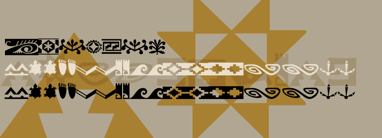
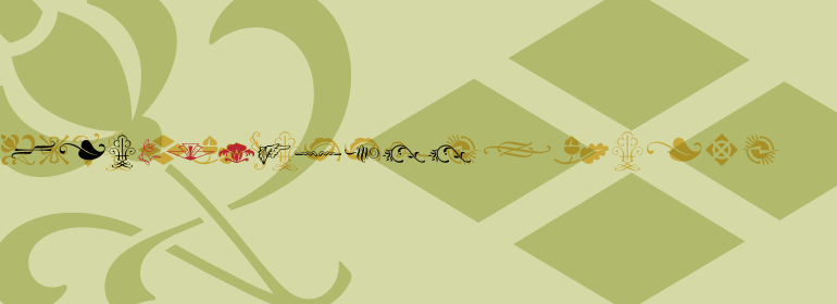
从风格上讲,Frutiger Capitalis Outline形成了一座通往Frutiger Capitalis Signs的桥梁——它本身就是完整的。Frutiger Capitalis Signs是一种个性的象征符号,许多符号是立即“可读的”,其他符号则留有一定可解释的空间。其中一些符号是Frutiger想象力的产物,如Frutiger的"Life Signs" ——柔和的手绘图形的线条没有明显的开始或结束,从而创造了内部和外部空间,每一眼都能看到新的形式。
这些轮廓图伴随着Frutiger的整个职业生涯——一个梦幻的花园,为他多年来严谨的字体设计提供了重要的平衡。
但他不认为自己是艺术家。Frutiger说他只是“想讲故事,画细并线,创做标志轮廓:这就是我的风格。”
Adrian Frutiger has created an entire typeface universe. He is especially well-known for his highly readable faces for longer texts (Meridien, Univers, Glypha, Linotype Centennial, etc.), but has also produced many popular decorative alphabets, such as Ondine, Phoebus, and President, which he created in Paris in 1953.
More recently, he has applied his skills to the typefaces of the Linotype Project Type before Gutenberg. These include the light-footed and extravagant Herculanum, the narrow Pompeijana with its diamond-shaped serifs and the robust Rusticana, all derived from Roman origins.
Frutiger Capitalis Regular and Outline belong in this group as well; however, they are not based on direct historical sources. At first glance, they may seem related to the roman type Capitalis Monumentalis, but opon closer examination, the fonts reveal a vitality unknown to the characters the Romans etched in stone. Frutiger confesses that creating Capitalis was "a liberation." After working on so many sophisticated and meticulously designed typefaces, Capitalis was a breath of fresh air.
Stylistically, Frutiger Capitalis Outline forms a bridge to Frutiger Capitalis Signs -- a whole universe of its own. Frutiger Capitalis Signs is a personal cosmos of symbols, many are immediately "legible", others leave room for interpretation. Some of the symbols are the product of Frutiger"s imagination, such as his "Life Signs" -- soft, hand drawn figures whose lines have no apparent beginning or end, creating both interior and exterior spaces, new forms emerging at each glance. These contoured drawings have accompanied Frutiger throughout his professional life -- a fantasy garden which has provided an important balance to his many years of disciplined typeface design. Yet he does not consider himself an artist. Frutiger says he simply "wants to tell stories, to draw thin lines, create contours of signs: that is my style.""
最近,他将自己的技能运用到了Linotype 的项目Type Before Gutenberg中。这其中包括轻盈且精美的Herculanum,带有菱形衬线的窄体Pompeijana,以及粗壮的Rusticana,它们均起源于Roman字重。
Frutiger Capitalis Regular和Outline也属于这一组;然而它们并没有直接的历史渊源。乍一看,它们似乎与罗马体Capitalis Monumentalis有关,但仔细一看发现该字体展现出了一种罗马人铭刻在磐石之上的字符所没有的活力。Frutiger承认,创建Capitalis是“一种解放”。在处理了许多复杂且精心设计的字体之后,Capitalis就像一缕新鲜的空气。
从风格上讲,Frutiger Capitalis Outline形成了一座通往Frutiger Capitalis Signs的桥梁——它本身就是完整的。Frutiger Capitalis Signs是一种个性的象征符号,许多符号是立即“可读的”,其他符号则留有一定可解释的空间。其中一些符号是Frutiger想象力的产物,如Frutiger的"Life Signs" ——柔和的手绘图形的线条没有明显的开始或结束,从而创造了内部和外部空间,每一眼都能看到新的形式。
这些轮廓图伴随着Frutiger的整个职业生涯——一个梦幻的花园,为他多年来严谨的字体设计提供了重要的平衡。
但他不认为自己是艺术家。Frutiger说他只是“想讲故事,画细并线,创做标志轮廓:这就是我的风格。”
Adrian Frutiger has created an entire typeface universe. He is especially well-known for his highly readable faces for longer texts (Meridien, Univers, Glypha, Linotype Centennial, etc.), but has also produced many popular decorative alphabets, such as Ondine, Phoebus, and President, which he created in Paris in 1953.
More recently, he has applied his skills to the typefaces of the Linotype Project Type before Gutenberg. These include the light-footed and extravagant Herculanum, the narrow Pompeijana with its diamond-shaped serifs and the robust Rusticana, all derived from Roman origins.
Frutiger Capitalis Regular and Outline belong in this group as well; however, they are not based on direct historical sources. At first glance, they may seem related to the roman type Capitalis Monumentalis, but opon closer examination, the fonts reveal a vitality unknown to the characters the Romans etched in stone. Frutiger confesses that creating Capitalis was "a liberation." After working on so many sophisticated and meticulously designed typefaces, Capitalis was a breath of fresh air.
Stylistically, Frutiger Capitalis Outline forms a bridge to Frutiger Capitalis Signs -- a whole universe of its own. Frutiger Capitalis Signs is a personal cosmos of symbols, many are immediately "legible", others leave room for interpretation. Some of the symbols are the product of Frutiger"s imagination, such as his "Life Signs" -- soft, hand drawn figures whose lines have no apparent beginning or end, creating both interior and exterior spaces, new forms emerging at each glance. These contoured drawings have accompanied Frutiger throughout his professional life -- a fantasy garden which has provided an important balance to his many years of disciplined typeface design. Yet he does not consider himself an artist. Frutiger says he simply "wants to tell stories, to draw thin lines, create contours of signs: that is my style.""


 京公网安备 11010802030123号


 商业发布授权
 出版物授权:针对出版物
 嵌入式应用授权