


品 牌:

设 计 师:
Tiemann,Walter
分 类:
正文字体、衬线体
字体属性:
外文
字体编码:
Unicode
标 签:
字体介绍:
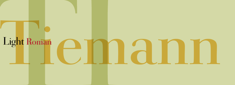
Tiemann字体由Walter Tiemann于1923年设计,由Klingspor字体铸造厂推出。
它是20世纪上半叶创作的现代书籍字体中的一款,但与大多数现代字体的形式不同。
它显示出相同强烈的笔划对比度和扁平的衬线,但它的比例与新文艺复兴字体的比例更为相似。
Tiemann字体优雅、清晰易读,适用于书籍和较长的文本,但由于其经典而不寻常的外观,也可用于标题、报纸以及杂志。
Tiemann font was designed by Walter Tiemann in 1923 and appeared with the Klingspor font foundry.
It is one of the modern book fonts created in the first half of the 20th century, but differed from most in its Modern Face forms.
It displays the same strong stroke contrast and flat serifs but its proportions have more in common with those of neorenaissance fonts.
Tiemann is an elegant, legible font suitable for books and longer texts, but also found in headlines, newspapers and magazines due to its classic yet unusual appearance.


 京公网安备 11010802030123号


 商业发布授权
 出版物授权:针对出版物
 嵌入式应用授权