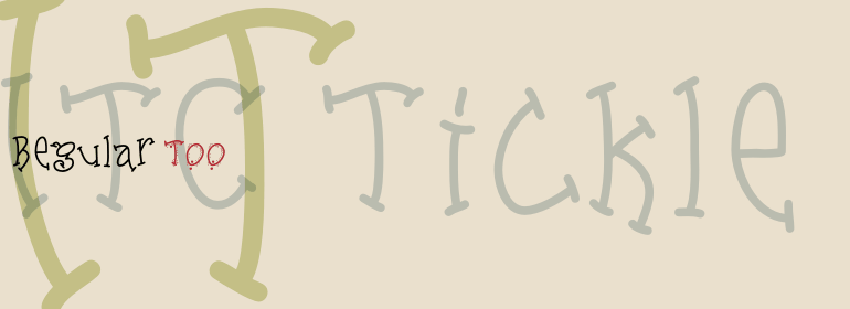
ITC Tickle™
I love the sensual. For me this and love for the sun has a share in brilliance and beauty
字体介绍:
看到自己的作品出现在图书馆书架上的兴奋感并没有减弱,但是今天,Lillie很有可能在一本书的封面上看到她的某一款字体。她创作了几种显示字体和图像字体。 “我第一款字体的设计是基于我在图书馆工作时做的刻字,为儿童区设计图形。” 她解释说,“我目前设计了很多的网页,但是字体是我最喜欢的。”
Tickles(ITC Tickle和ITC Tickle Too)是Lillie发布的第一款ITC字体版本。 “有一天,我拿着Sharpie马克笔写字,我很喜欢那些字母的样子。”她回忆说,“我在Fontographer中从头开始重做字母来尝试会有什么进展,然后我也很喜欢那些字母。”
ITC Tickle是一种明显违反了一两个排印规则的双格式字体(大写字母与小写字母的尺寸一样)。ITC Tickle Too具有相同的基本字形,但是它们集群的斑点使设计具有三维特征。最后就出现了一个友好的、标新立异的、能够为您的工作增添乐趣的显示字体家族。
When Patricia Lillie was growing up, she thought the coolest thing in the world would be finding her own name listed in a library catalog. The fantasy came true in 1986 when her first children's book was published. Five more followed. The thrill of seeing her work on library shelves hasn't abated, but today, Lillie is just as likely to see one of her typefaces on the cover of a book. She has created several display faces and image fonts. My first typeface designs were based on lettering I'd done while working for a library, doing graphics work for the children's section," she explains. "I currently do a lot of web design, but type is my favorite thing." The Tickles (ITC Tickle and ITC Tickle Too) are Lillie's first ITC typeface releases. "I was playing around with a Sharpie marker one day and liked the way the letters looked," she recalls. "I started redoing the letters from scratch in Fontographer to see what developed, and liked those letters too." ITC Tickle is a bi-form font (with both cap and lowercase letters of the same size) that clearly breaks a typographic rule or two. ITC Tickle Too has the same basic lettershapes, but they've grown clusters of stipples that give a three-dimensional quality to the design. The result is a friendly, offbeat display family that's guaranteed to add a giggle to your work."









 商业发布授权
 出版物授权:针对出版物
 嵌入式应用授权


