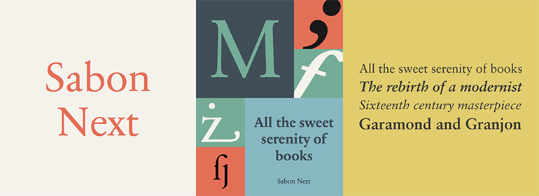
Sabon® Next
字体介绍:
当然,Porchez是基于第二个版本创作的Sabon Next同时也参考了原始的Garamond模型,细致地改进了现有的数字化Sabon的比例。新字体家族很大而且用途广泛,包括罗马体和斜体,每中都有从regular 到black的6个字重。大多数字重都有小型大写字母、老式数字、替换字形(花体字、连字等);还有一种有许多可爱百合花的装饰字体。标准版本包括修订后的数字,它们被特意设计成略小于大写字母。
The design of Sabon Next™ by Jean François Porchez, a revival of a revival, was a double challenge: to try to discern Jan Tschichold´s own schema for the original Sabon, and to interpret the complexity of a design originally made in two versions for different typecasting systems.
The first was designed for use on Linotype and Monotype machines, and the second for Stempel hand composition. Because the Stempel version does not have the constraints necessary for types intended for machine composition, it seems closer to a pure interpretation of its Garamond ancestor.
Naturally Porchez based Sabon Next on this second version and also referred to original Garamond models, carefully improving the proportions of the existing digital Sabon while matching its alignments.
The new family is large and versatile - with Roman and italic in 6 weights from regular to black. Most weights also have small caps, Old style Figures, alternates (swashes, ligatures, etc); and there is one ornament font with many lovely fleurons. The standard versions include revised lining figures that are intentionally designed to be a little smaller than capitals."









 商业发布授权
 出版物授权:针对出版物
 嵌入式应用授权


