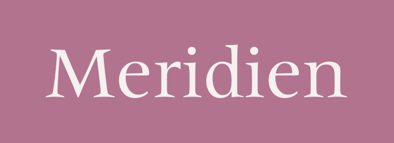
Meridien®
字体介绍:
Meridien was developed in the mid-1950s, and released by the French foundry Deberny & Peignot in 1957. After studying a typeface from the sixteenth century, the Swiss designer Adrian Frutiger was inspired to create an alphabet without any completely straight strokes, and he hoped the reader of a text set in this typeface would feel as though wandering through a forest. The designer of more than 100 typefaces, Frutiger considers Meridien to be his best. With its slightly flared stems and triangular shaped serifs, Meridien is at once sharp, graceful, arresting, and sensuous; much like a forest. Use the roman when you want to create a distinctive graphic expression in book text. For posters and websites, the italic or the bold weights or even the roman set in all caps will give an impression of quiet dignity.









 商业发布授权
 出版物授权:针对出版物
 嵌入式应用授权


