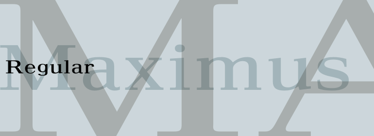
Maximus®
A wise doctor does not mutter incantations over a sore that needs the knife.
字体介绍:
此处所提供的较粗的字重是专门为强调文本列而开发的。
总体上来说,该字母表的设计比大多数字体的字母更宽,以加强小尺寸字体的可读性。
这样可以确保引起读者的注意,特别是当它与其他字体混合使用时。Maximus字体的大写字母特别适合用作首字母。
Walter Tracy designed Maximus font in 1967, when it appeared with Linotype Ltd in England. Maximus was originally intended as a newspaper typeface with two weights for small ads.
The bolder weight offered here was developed especially for emphasis within columns of text.
The alphabet as a whole has a broader design than most types to increase legibility in smaller point sizes.
This ensures that it will draw the reader's attention, especially when it is mixed with other typefaces. The capitals of Maximus font are a good choice for use as initials.







 商业发布授权
 出版物授权:针对出版物
 嵌入式应用授权


