LinoLetter™
The comic and the tragic lie inseparably close, like light and shadow.
字体介绍:
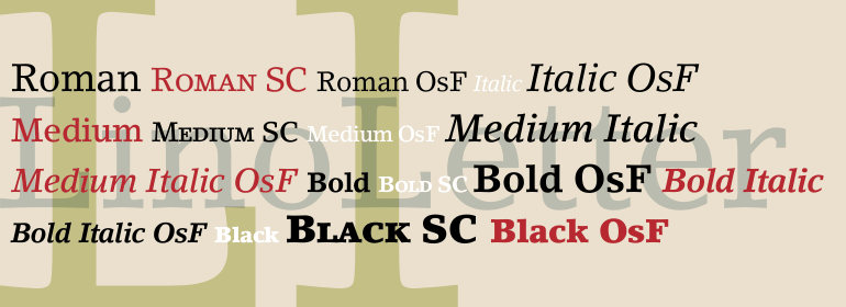
In the 1980s, Linotype worked with the Basel School of Design (Switzerland) to create a new typeface that would be maximized for optimum legibility. Professor Andre Gürtler oversaw the research for the project, along with Reinhard Haus and the Linotype Design Studio. The goal was to create a typeface to work with contemporary typesetting and printing technologies. Linotype released the result, LinoLetter, in 1992. Legibility typefaces are designed for printing under the poorest and most varied of conditions; LinoLetter is therefore ideal for newspaper work as well as other mass-produced printed pieces.







 商业发布授权
 出版物授权:针对出版物
 嵌入式应用授权


