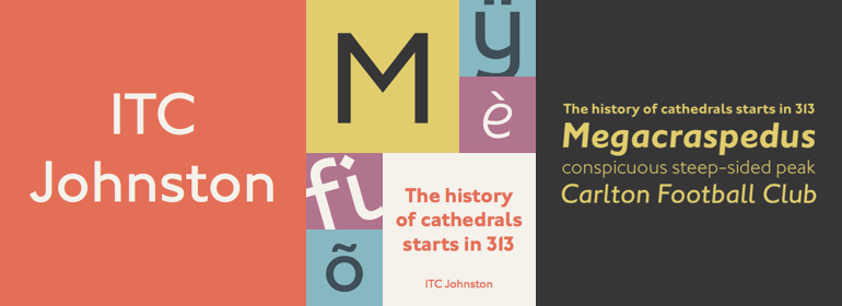
ITC Johnston™
字体介绍:
Johnston的字母是根据他在大英博物馆对历史书写技巧的研究而精心建构的。他的大写字母取自最优秀的古典罗马铭文。“他对无衬线字体样式有着严格的规定”,Farey说,“特别是线条的粗细结构,高度与粗细的比例是1:7,因此水平线和垂直线的厚度是一样的。Johnston的O、C和G,甚至是S的圆都是正圆。这对于文本大小来说是个问题,或者实际尺寸小于半英寸。它还排除了任何其他的字重,但中等粗细除外,以及任何比1:7的比例更细或者更粗的字重。“Johnston在他所进行的任何项目中都表现得很慢,这是众所周知的。”,Farey说, “在抗议之下,他最终用了20年创作了一个较粗的字重(仅有大写字母)。”
Farey和他的同事Richard Dawson将ITC Johnston建立在Edward Johnston的原始block letter的基础之上,并将其扩展称一个包含三种字重的字体家族。据Farey所说,Johnston本人从未把他的Underground字体称为字体。这是一个用于标识和其他显示目的的字母系统,旨在使人们一目了然,而不仅仅是在文字段落中可读。Farey和Dawson的改编版本保留了Johnston字母的鲜明风格,同时又很好地融入到了文本中。
Johnston的block letter与Gill Sans相似,后者是Monotype在20世纪20年代成发展起来的一个非常成功的字体家族。年轻的Eric Gill曾在伦敦印刷学院师从Johnston,与他一起从事Underground项目,并遵循许多相同的原则开发了他自己的无衬线字体。自第一次世界大战之后,Johnston字母使伦敦交通运输系统有一种独特的风格,但几十年来,Gill Sans已经成为英国平面设计标志性的字母形式。(Johnston的无衬线字体一直用于Underground项目,直到20世纪80年代初,伦敦的设计公司Banks and Miles设计了一个x高度更高的修订版和现代化版本。)
Farey和Dawson在他们位于伦敦的Clerkenwell的工作室工作,他们希望创作一个既不是博物馆展品,也不是拙劣的字体家族,这将为无处不在的Gill Sans提供“一种同流派的替代字体”。“这些字母”,Farey在谈到Johnston字母时说:“从未发展成现代风格。”他和Dawson不仅设计了ITC Johnston的三种字重,还为每种字重都提供了一套完整的小型大写字母(这是原始的Johnston字体和Gill字体都没有的),还有老式数字和几个替代字符。
ITC Johnston is the result of the combined talents of Dave Farey and Richard Dawson, based on the work of Edward Johnston. In developing ITC Johnston, says London type designer Dave Farey, he did “lots of research on not only the face but the man.” Edward Johnston was something of an eccentric, “famous for sitting in a deck chair and carrying toast in his pockets.” (The deck chair was his preferred furniture in his own living room; the toast was so that he’d always have sustenance near at hand.) Johnston was also almost single-handedly responsible, early in this century, for the revival in Britain of the Renaissance calligraphic tradition of the chancery italic. His book Writing & Illuminating, & Lettering (with its peculiar extraneous comma in the title) is a classic on its subject, and his influence on his contemporaries was tremendous. He is perhaps best remembered, however, for the alphabet that he designed in 1916 for the London Underground Railway (now London Transport), which was based on his original “block letter” model.
Johnston’s letters were constructed very carefully, based on his study of historical writing techniques at the British Museum. His capital letters took their form from the best classical Roman inscriptions. “He had serious rules for his sans serif style,” says Farey, “particularly the height-to-weight ratio of 1:7 for the construction of line weight, and therefore horizontals and verticals were to be the same thickness. Johnston’s O’s and C’s and G’s and even his S’s were constructions of perfect circles. This was a bit of a problem as far as text sizes were concerned, or in reality sizes smaller than half an inch. It also precluded any other weight but medium ‘ any weight lighter or heavier than his 1:7 relationship.” Johnston was famously slow at any project he undertook, says Farey. “He did eventually, under protest, create a bolder weight, in capitals only ‘ which took twenty years to complete.”
Farey and his colleague Richard Dawson have based ITC Johnston on Edward Johnston’s original block letters, expanding them into a three-weight type family. Johnston himself never called his Underground lettering a typeface, according to Farey. It was an alphabet meant for signage and other display purposes, designed to be legible at a glance rather than readable in passages of text. Farey and Dawson’s adaptation retains the sparkling starkness of Johnston’s letters while combining comfortably









 商业发布授权
 出版物授权:针对出版物
 嵌入式应用授权


