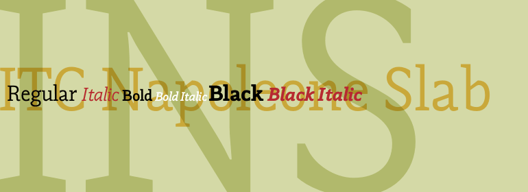
ITC Napoleone™ Slab
If a man is proud of his wealth, he should not be praised until it is known how he employs it.
字体介绍:
根据设计师Silvio Napoleone所说,“这个概念是根据我在刻字班学习时的探索发展而来的。我用画笔画了许多具有历史感的字形。之后的几年里,我继续进行实验,通过手工绘制以及在计算机上进行绘制。最后,我选择了slab serif用于生产,因为它具有独特的设计质感。”
ITC Napoleone Slab非常通用。这个家庭的宽度很节省空间,包含真正的斜体设计、老式数字和一整套特殊的连字。根据Silvio的说法,“Napoleone Slab是为了可以用于各种尺寸以及屏幕应用而设计” 。
Silvio目前居住在多伦多,他在一家“年轻、热情的交互公司”工作。他的设计曾在国内外展出过,他的作品也曾是美国平面艺术学院巡回展览的一部分。
There is something straight-forward and no-nonsense about slab serifed typefaces. Calligraphic designs, on the other hand, evoke a sense of humanity and immediacy - even intimacy. ITC Napoleone Slab combines both slab serif and calligraphic design traits into a single typeface design. Heady stuff. The result is unlike almost any other slab serif typeface.
According to designer Silvio Napoleone, “The concept developed from my explorations as a student in an independent lettering class. I sketched many historical letterforms by brush. I continued experimenting for several years after, sketching by hand and on the computer. Eventually, I chose the slab serif for production because of its distinctive design quality.”
ITC Napoleone Slab is exceptionally versatile. The family is economical in width and contains true italic designs, oldstyle numbers and a suite of special ligatures. According to Silvio, “Napoleone Slab was designed to work well at all sizes, and in on-screen applications.”
Silvio currently lives in Toronto, where he works for a “young, enthusiastic interactive firm.” His designs have been exhibited nationally and internationally, and his work was also part of a traveling exhibit for the American Institute of Graphic Arts.


 商业发布授权
 出版物授权:针对出版物
 嵌入式应用授权


