Guardi®
The comic and the tragic lie inseparably close, like light and shadow.
字体介绍:
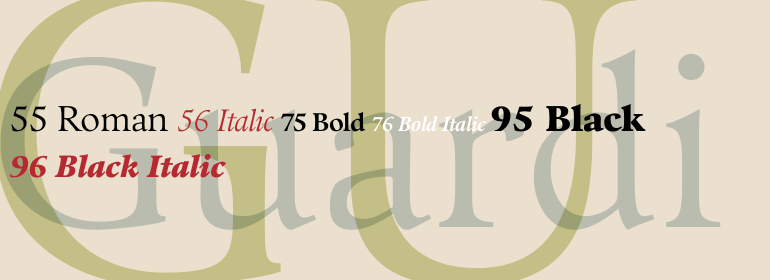
Guardi was designed by Professor Reinhard Haus, and was released by Linotype in 1986. Haus was inspired by the Venetian Oldstyle types of the fifteenth century, such as the one used by printer and publisher Nicolas Jenson. Guardi was named for Francesco Guardi, the great eighteenth-century painter from Venice. True to its roots, the Guardi type has the characteristic Venetian oldstyle lowercase e with angled crossbar, calligraphic terminal strokes, and gentle swells from main strokes into serifs. This is a sensitive interpretation that meets modern needs with weights from regular to black. Use Guardi to impart a mood of grace and fluidity in text composition, headlines and display graphics.


 商业发布授权
 出版物授权:针对出版物
 嵌入式应用授权


