Finnegan®
字体介绍:
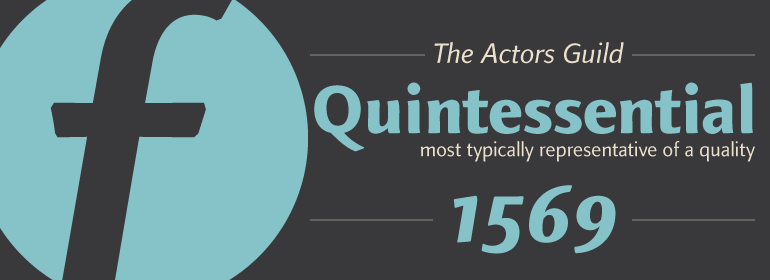
Linotype Finnegan是一款全新的、独特的字体。它以其极高的易读性、独创性以及形式上的卓越性而与众不同。即使是不间断地阅读较长文本,Linotype也可以让其变得有趣。然而,字体永远不能因为要过于突出其本身而把人们的注意力从文本内容上转移开。
German designer Jürgen Weltin designed Linotype Finnegan, a modern text design with roots in the humanist letterforms of the Renaissance. As the recognizable direction of movement in writing runs from upper left to lower right, Weltin mimicked this in his design: Linotype Finnegan's up and down strokes end in residual serifs. All of the thick strokes have a taper; horizontal strokes and curves are noticeably thinner than the verticals. This dynamic nature lends a combination of individualness and energy, along with a high degree of variety, to Linotype Finnegan.
Linotype Finnegan is a wholly new and unique typeface. It distinguishes itself through its extreme legibility, originality, and formal excellence. Linotype Finnegan makes fun to read longer texts non-stop. However, the typeface never distracts the attention from the text's content by forcing itself too much into the foreground.










 商业发布授权
 出版物授权:针对出版物
 嵌入式应用授权


