Fette Fraktur™
字体介绍:
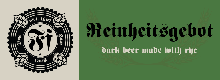
Fette Fraktur was issued by the C.E. Weber foundry in Germany in 1875. This is specific Gothic-based lettering suitable for jobs where extreme contrast or specific period should be evoked. Nevertheless, the rendering is sophisticated and offers an historic atmosphere as would be associated with the Black Lettering of the Middle Ages. As the name suggests, Fette Fraktur has a fat, broken appearance. The Fette Fraktur font should be set in sizes over 18pt to ensure better legibility and quality output, due to the high contrast between the very thick and the very thin strokes which have been maximized. Fette Fraktur is a trademark of Linotype GmbH and may be registered in certain jurisdictions.














 商业发布授权
 出版物授权:针对出版物
 嵌入式应用授权


