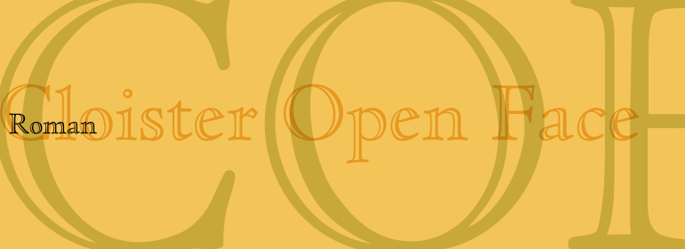
Cloister™ Open Face
The comic and the tragic lie inseparably close, like light and shadow.
字体介绍:
1458年,查理七世派法国人Nicolas Jenson在美因茨学习活字印刷术。Jenson本该带着他新学的技能回到法国,但是正如当时其他的巡回印刷工一样,他去了意大利。从1468年开始,他就待在威尼斯,在这里他成为了一名字冲雕刻师、印刷商以及出版商。他可能是第一个使用活字印刷的非德国人,而且印刷了大约150种版本。尽管没有什么影响力了,但他的书却没有消失,那些从大约1470年到1480年他去世的这几年里所创作的作品一直是字体设计师们灵感的源泉。他的Roman字体通常被称为是第一个真正的Roman。“值得注意的是,几乎所有Jensonian Romans的小写字母e的横梁(crossbar)都是倾斜的,被称为“维也纳老式风格的e”。
Cloister Open Face was designed in 1929 by Morris Fuller Benton as one weight of the Cloister Old Style family. Cloister itself appeared from 1897 with American Type Founders, and later for the typesetting machines of the Linotype, Intertype and Monotype companies. At that time, it was the truest modern industrial revival of the Jensonian Roman. Benton stayed close to the style of his model in both design and spacing. Cloister Open Face has an old-world elegance, and it works well for titling in books and magazines.
In 1458, Charles VII sent the Frenchman Nicolas Jenson to learn the craft of movable type in Mainz, the city where Gutenberg was working. Jenson was supposed to return to France with his newly learned skills, but instead he traveled to Italy, as did other itinerant printers of the time. From 1468 on, he was in Venice, where he flourished as a punchcutter, printer and publisher. He was probably the first non-German printer of movable type, and he produced about 150 editions. Though his punches have vanished, his books have not, and those produced from about 1470 until his death in 1480 have served as a source of inspiration for type designers over centuries. His Roman type is often called the first true Roman." Notable in almost all Jensonian Romans is the angled crossbar on the lowercase e, which is known as the "Venetian Oldstyle e.""








 商业发布授权
 出版物授权:针对出版物
 嵌入式应用授权


