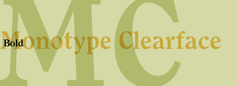
Monotype Clearface™
Self-will in the man who does not reckon wisely is by itself the weakest of all things.
字体介绍:
A rather narrow and compact design, Monotype Clearface combines both old style and antique characteristics. The lowercase letters are tall, the ascenders and descenders quite short. The intention was to produce a typeface that was easy to read in small sizes, hence the name. Monotype Clearface Bold was first cut for mechanical composition in 1922, and was based on the Clearface Gothic design created by Morris Fuller Benton for ATF in 1910. Although designed as a text face, Monotype Clearface is now more commonly used in advertising and display work.


 商业发布授权
 出版物授权:针对出版物
 嵌入式应用授权


