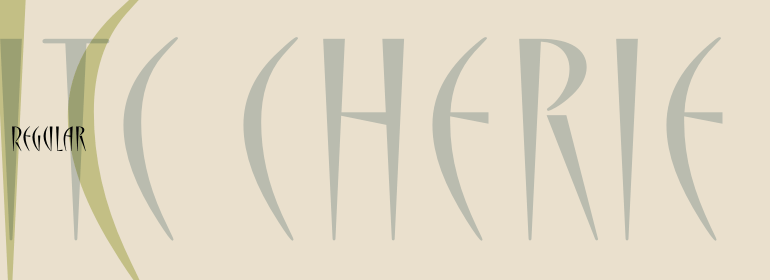
ITC Cherie™
I would prefer as friend a good man ignorant than one more clever who is evil too.
字体介绍:
ITC Cherie is the work of calligrapher and designer Teri Kahan, who is self-admittedly most partial to scripts and elements created with the brush". The design is based on a logo she developed with a "sophisticated, feminie look" and the result is a condensed display typeface whose forms consist of sharply tapering strokes. Cherie is an all caps typeface with two different sets of capitals. The difference between the two lies mostly in the height of the cross strokes, high in the first alphabet, low in the second, although they also display other form variations. ITC Cherie thus provides the opportunity for subtle changes in a line of text."








 商业发布授权
 出版物授权:针对出版物
 嵌入式应用授权


