Burgstaedt Antiqua™
字体介绍:
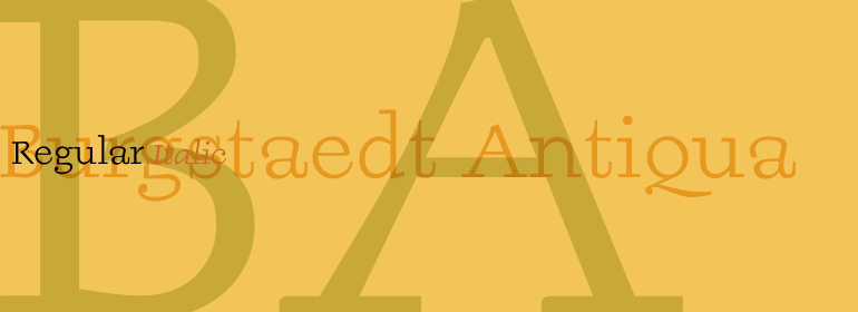
Burgstaedt Antiqua Regular和Burgstaedt Antiqua Italic既可以用做文本也可以用作标题。为了在文本中使用,我们建议使用稍大的磅值(12pt或14pt及以上)。英国设计师Richard Yeend于2002年设计了这个字体家族。
At first glance, Burgstaedt Antiqua looks like an old typewriter face, or rather like a typeface from a typewriter that has gone hopelessly wrong! Only after your second glance will you see this font for what it really is - a thoroughly new text face. Several features of Burgstaedt Antiqua, and its companion italic face, are worth special attention: First, the terminal styles of the letters vary throughout the alphabet. This gives text set in Burgstaedt Antiqua a slightly jittery feeling. A second interesting feature is the lowercase q", which takes the form of a shrunken-down uppercase "Q". Burgstaedt Antiqua Regular and Burgstaedt Antiqua Italic may be used in both text and headlines. For use in text, we recommend employing a slightly larger point size (12 pt or 14 pt and above). British designer Richard Yeend designed this family in 2002.











 商业发布授权
 出版物授权:针对出版物
 嵌入式应用授权


