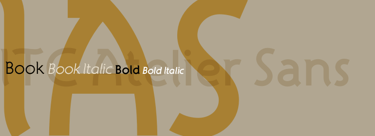
ITC Atelier™ Sans
I would prefer as friend a good man ignorant than one more clever who is evil too.
字体介绍:
ITC Atelier Sans began as one of Curtis's renovations. His goal was to create a monoline design with Art Deco “sensibilities,” but without the geometric precision and relatively small x-height of faces like Futura or Kabel. Gentle curves and suggestions of serifs create a crisp, clean and open face that is at once sleek, sensuous and still affable. Available as a two-weight family with complementary italics, ITC Atelier Sans is another successful and usable revival from Nick Curtis.










 商业发布授权
 出版物授权:针对出版物
 嵌入式应用授权


