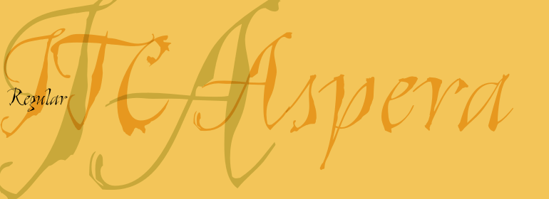
ITC Aspera™
Bad men live that they may eat and drink, whereas good men eat and drink that they may live.
字体介绍:
“这个想法是为了保持我的笔刷所画的线条的风格,所以我尽量让扫描的形状接近原始的形状,做了些干预以保持一致的比例、倾斜度和字重。”虽然该字体不是一款连接的手写体,但Stojadinovic确实创作了许多字母,例如'o'和's'是自然连接的字符。她还绘制了一组连字和配套的装饰字符以配合设计。
ITC Aspera is the product of graphic experimentation. Olivera Stojadinovic, who designed the face, recalls, Over the last 15 years, I have made several small prints using Cyrillic characters. Often, I made my first sketches with a special pointed brush which was difficult to manipulate well, but once tamed, gave me interesting results." Stojadinovic decided to see if she could reproduce the unique brush quality in digital form.
"The idea was to preserve the look of strokes made by my brush, so I kept the scanned shapes as close as possible to the originals, making interventions just to maintain consistent proportions, slope and weight." While this typeface is not a connecting script, Stojadinovic did create a number of letters, such as the 'o' and 's' that are natural connecting characters. She also drew a set of ligatures and matching ornaments to accompany the design."






 商业发布授权
 出版物授权:针对出版物
 嵌入式应用授权


