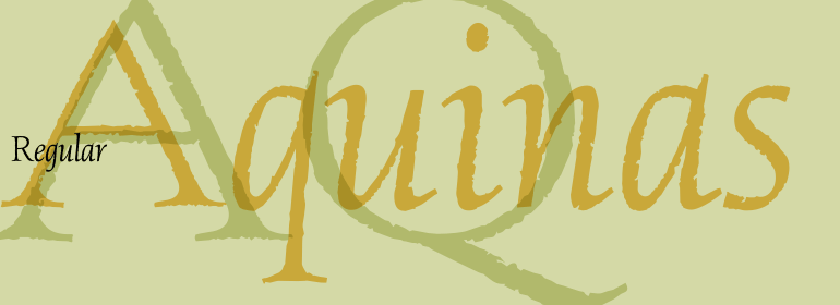
Aquinas™
字体介绍:
Aquinas was designed by David Quay in 1989. It is distinguished by the contrast between its upright, generous capitals and its narrow, slanted lower case letters which look almost like italics. The combination of these so different alphabets creates an opportunity to give texts an unusual yet elegant look. Aquinas is suitable for both running text and headlines and should be used in point sizes of 10 or larger. The lyrical and sophisticated feel of Aquinas makes it a particularly good typeface for poems, songs and other artistic texts.


 商业发布授权
 出版物授权:针对出版物
 嵌入式应用授权


