


品 牌:

设 计 师:
Veres,Paul
分 类:
无衬线体
字体属性:
外文
字体编码:
Unicode
标 签:
字体介绍:
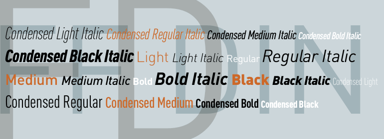
Aperto由Paul Veres于1996年设计,是一款典型的具有过渡时期字体风格的文本字体,例如其经常使用的Times。它具有罗马体、半粗体以及粗体两种字重,每种都有其相对应的斜体。罗马字重包括完整的老式数字以及小型大写字母。平衡、保守的外观使Aperto极为灵活,非常适合长文本和标题。
Aperto was designed by Paul Veres in 1996 and is a typical text font in the style of Transitional faces, like its often-used cousin Times. It is available in roman, semibold and bold weights, each with its matching italic. The roman weight is complete with old style figures and small caps. Its balanced, reserved appearance makes Aperto extremely flexible, good for long texts as well as headlines.
Aperto was designed by Paul Veres in 1996 and is a typical text font in the style of Transitional faces, like its often-used cousin Times. It is available in roman, semibold and bold weights, each with its matching italic. The roman weight is complete with old style figures and small caps. Its balanced, reserved appearance makes Aperto extremely flexible, good for long texts as well as headlines.


 京公网安备 11010802030123号


 商业发布授权
 出版物授权:针对出版物
 嵌入式应用授权