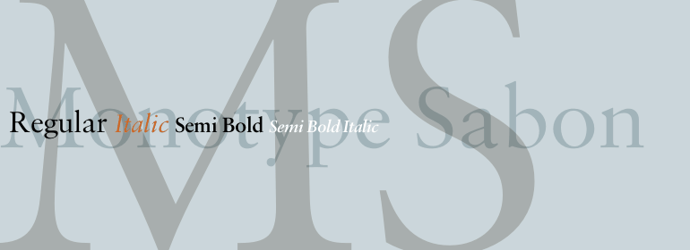
Monotype Sabon®
字体介绍:
它以Jacques Sabon的名字命名,Jacques Sabon是16世纪的一位铸字师,他的遗孀后来嫁给了另一位铸字师Konrad Berner,后者因发行了第一位铸字师的样本表而受到赞誉。表中的几种字体都归于Claude Garamond,其中的一种认为Tschichold源自Sabon Roman。斜体字是基于Berner表中的另一款字体,由Robert Granjon剪裁而成。Tschichold对这些老式字体进行了巧妙的改编,从而创造了一种优雅而精巧的书籍字体。Sabon字体家族是设置文本的热门之选。
Sabon was designed by Jan Tschichold and released in 1967. Sabon was created in response to the specific needs of a group of German printers who wanted a typeface that would be identical in form when produced by three different metal-casting technologies. Named after Jacques Sabon, a sixteenth century typefounder whose widow married another typefounder, Konrad Berner, who is credited with issuing the first typefounder's specimen sheet. Several types on the sheet were attributed to Claude Garamond, and one of these served Tschichold as the source for Sabon roman. The italic was based on another face on Berner's sheet, cut by Robert Granjon. Tschichold's skillful adaptation of these old style faces has produced an elegant and workmanlike book face. The Sabon font family is a popular choice for setting text.


 商业发布授权
 出版物授权:针对出版物
 嵌入式应用授权


