Posterama™
字体介绍:
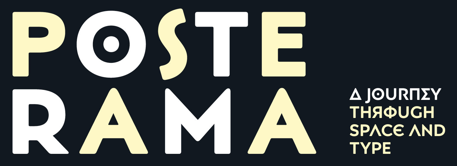
通过使用一些可替换字形,Posterama将整个世纪的未来主义参考点从艺术、建筑、海报设计和科幻小说可视化到一个家族中,有一种令人回味的韵味。
Posterama Text是基本的字体家族。它拥有最强健的字符集,包括大小写字母符号以及对泛欧洲语言的支持(包括希腊文和西里尔文)。注意:下面描述的所有Posterama的其他变体都没有小写字母或者对希腊文和西里尔文的支持。
Posterama 1901回顾了20世纪之交Art Nouveau的几何装饰风格。 细长、蛇形的“S”,高腰的“E”和带下划线的“O”等字母形式,重振了Charles Rennie Mackintosh和维也纳独立运动的设计师们的精神。1913年,美国举办了军械库展(Armory Show),即1913年的现代艺术展(Exhibition of Modern Art),首次将毕加索(Picasso)、杜尚(Duchamp)和康定斯基(Kandinsky)等欧洲艺术家的革命性作品带到美国,令媒体和公众震惊。近乎抽象的、棱角分明的字符,如“A”、“E”和“N”,暗示了立体主义参差不齐、相互冲突的平面。
Posterama 1919使用了一个很小的变体,但却很重要,它为包豪斯的建立,以及随后激进的欧洲印刷风格的兴起定下了基调。直边圆头的“A”为其增添了一份1919年的韵味——这种风格的“A”仍然可以从 1934年设计的Braun商标上看到。
Posterama 1927抓住了《大都会》、《爵士歌王》上映的那一年以及Paul Renner于 1927年开始创作的几何字体Futura,这对美国和欧洲的设计产生了深远的影响。
Posterama 1933——Posterama 1933字体家族凭借其低腰、蜿蜒的设计与装饰艺术(Art Deco)时期的刻字相呼应,而这种艺术又植根于曾对Posterama 1901产生过关键影响的新艺术(Art Nouveau)。这两种字体可以完美合作,也可以互换使用。Posterama 1945——以一些西里尔字符为特色,让人联想到俄罗斯艺术和政治海报在冷战宣传、间谍活动以及巨型外星人和怪物中脱颖而出的时代。
Posterama 1984——George Orwell的经典小说、反乌托邦动作片及科幻电影 (《银翼杀手》、《录像带谋杀案》和《终结者》)的宣传片、以及在那个时代造有着重大影响力的游戏如Space Invaders和Pac-Man,都对Posterama 1984的排印产生了影响。
Posterama 2001的灵感来自Stanley Kubrick的科幻杰作,该作品中大量使用了Futura字体。Posterama 2001通过NASA曾经使用过的“worm”商标中整流罩风格的“A”发现了它自己的轨道。早在1920年,包豪斯设计就有类似的效果,其极简主义几何刻字的特征也是有一个没有横杆的“A”。
The Posterama™ typeface family contains 63 fonts and is a true journey through space and time. Designed by Jim Ford, each Posterama family contains 7 weights from Thin to Ultra Black, in 9 distinct families. What makes Posterama so unique and versatile are the eight alternative display families. By making use of a collection of alternative glyphs, Posterama sets an evocative flavor to visualize an entire century of futuristic reference points from art, architecture, poster design and science fiction into one family.
Posterama Text is the base family. It has the most robust character set including upper and lowercase glyphs and pan-European language support (including Greek and Cyrillic). Note: all the other Posterama variants described below do not have lowercase letters or Greek and Cyrillic support.
Posterama 1901 recalls the decoratively geometric style of Art Nouveau from the turn of the 20th century. Letterforms such as the slender, snaking 'S', the high-waisted 'E' and the underlined 'O' revive the spirit of Charles Rennie Mackintosh and the designers of the Viennese Secession.
Posterama 1913 pays homage to the Armory Show, or 1913 Exhibition of Modern Art, which brought the revolutionary work of European artists such as Picasso, Duchamp and Kandinsky to the US for the first time to the shock and astonishment of press and public. Near-abstract, angular characters such as the 'A', 'E' and 'N' hint at cubism's jagged and clashing planes.
>Posterama 1919 uses a small, but important, variation to set a tone when the Bauhaus was founded, and the surge in radical European typography that followed. The straight-sided, roundheaded 'A' adds a flavor of 1919 - this style of 'A' can still be seen in the Braun logo, designed in 1934.
Posterama 1927 captures the year of Metropolis, The Jazz Singer and Paul Renner's pioneering, geometric Futura typeface from 1927, which had a profound influence on design in the US and Europe.
Posterama 1933 - With its low-waisted, sinuous designs, the Posterama 1933 typeface family echoes lettering of the Art Deco period, which in turn had its roots in Art Nouveau, the key influence on Posterama 1901. The two fonts make a great team and can be used interchangeably.
Posterama 1945 features a few Cyrillic characters to conjure up an era when Russian art and political posters made their mark in cold war propaganda, espionage and also giant aliens and monsters.









 商业发布授权
 出版物授权:针对出版物
 嵌入式应用授权


