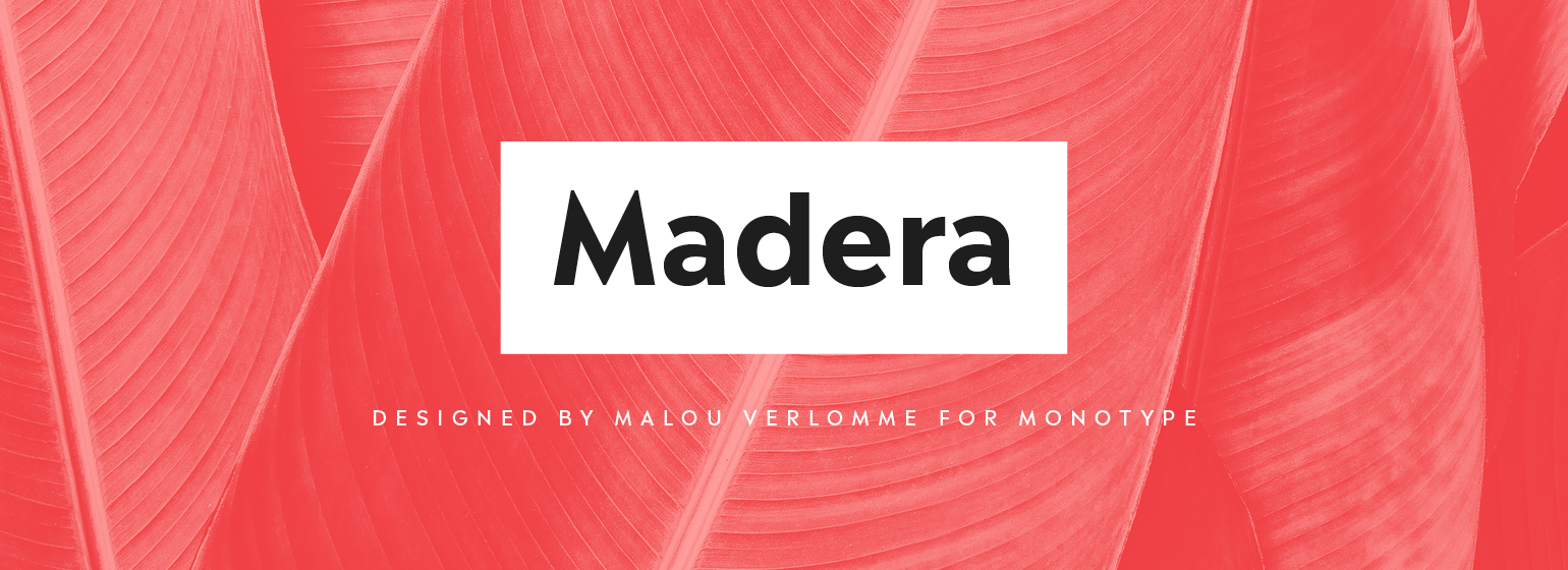
Madera™
字体介绍:
Overview Malou Verlomme’s Madera is a sharp-tongued take on geometric typefaces, created to be an essential toolbox for graphic designers. History of the typeface Verlomme’s approach was heavily informed by his own experience creating bespoke type for brands, as well as a background creating typefaces in partnership with graphic designers. It’s the user he has in mind for this typeface, which is intended as an easy, efficient, and adaptable design – tailored to the ways graphic designers actually use fonts. It also designed to tap into a trend for geometric sans serifs, in the style of other popular designs such as Proxima Nova, Avenir or Gotham. About the designer Malou Verlomme is an award-winning French typeface designer working as a Senior Type Designer at Monotype UK, since 2016. He has a Graphic Design degree from l'École Duperré in Paris, and an MA in Typeface Design from the University of Reading. He taught type design at several universities in Paris and still occasionally lectures and gives workshops. His typeface Camille has the honor of being part of the collection at France’s Centre National des Arts Plastiques (CNAP). His typefaces include Ecam and Totem published with the foundry LongType, which he co-founded in 2012. In 2016 he designed the Johnston100 typeface for TfL, London’s new underground typeface. Design traits The Madera typeface family has 16 fonts: 8 weights of both upright and italics. It is available in OpenType CFF and TTF fonts formats. Each typeface contains over 650 glyphs with extensive Western, Central and Eastern European language support. It also supports OpenType typographic features like alternatives, ligatures and fractions. It lives somewhere between humanist and geometric styles, and features sharp apexes that add some extra flavour – particularly when set in all caps, or when used at darker weights. Usage Madera has been created as the ultimate easy-to-use typeface for graphic designers, designed to work across environments and be highly legible whether used in print, or on screen. Its appearance is restrained, making it perfect for branding messages, but still includes punchy details that add some undeniable bite.









 商业发布授权
 出版物授权:针对出版物
 嵌入式应用授权


