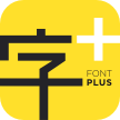
Linotype Paint It™
Remember what is unbecoming to do is also unbecoming to speak of.
字体介绍:
Jochen Schuss designed Linotype Paint It in 1997 with exclusively capital letters and in two weights. The best way to describe the weight Paint It might be to compare it with a labyrinth in which the figures only become clear to the reader dedicated to finding them. The second weight, Paint It black, is almost the solution to this puzzle. The characters are black and stand out strikingly from the background. Linotype Paint It is particularly good for headlines in large point sizes or wherever a text should display a playful character.










 商业发布授权
 出版物授权:针对出版物
 嵌入式应用授权


