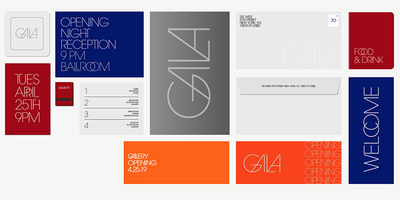
ITC Avant Garde Gothic® Condensed
The comic and the tragic lie inseparably close, like light and shadow.
字体介绍:
窄体由Ed Benguiat于1974年绘制,斜体由AndréGürtler、Erich Gschwind及Christian Mengelt于1977年设计。
原始设计包括一个用于设置标题的版本和一个用于文本正文的版本。但是,在最初的数字化过程中仅选择了文本设计,并且未包括连字和替代字符。
该字体家族包括5个字重(窄体有4个),以及用于最大宽度字体的斜体作为补充。
当ITC发布该字体的OpenType版本时,它还包括了原始的33个替换字符和连字以及额外的字符。
ITC Avant Garde Gothic is a font family based on the logo font used in the Avant Garde magazine. Herb Lubalin devised the logo concept and its companion headline typeface, then he and Tom Carnase, a partner in Lubalin’s design firm, worked together to transform the idea into a full-fledged typeface.
The condensed fonts were drawn by Ed Benguiat in 1974, and the obliques were designed by André Gürtler, Erich Gschwind and Christian Mengelt in 1977.
The original designs include one version for setting headlines and one for text copy. However, in the initial digitization, only the text design was chosen, and the ligatures and alternate characters were not included.
The font family consists of 5 weights (4 for condensed), with complementary obliques for widest width fonts.
When ITC released the OpenType version of the font, the original 33 alternate characters and ligatures, plus extra characters were included.












 商业发布授权
 出版物授权:针对出版物
 嵌入式应用授权


