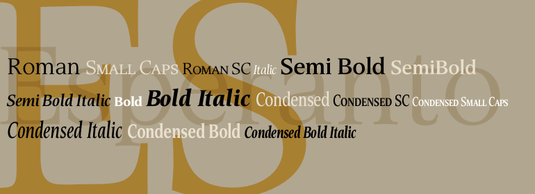
Esperanto™
I would prefer as friend a good man ignorant than one more clever who is evil too.
字体介绍:
Franko Luin, Esperanto's designer, on this typeface: Esperanto has a lot in common with classic typefaces, and newer interpretations of the classics. The italic reminds of the lettering idea of the Renaissance and their manuscripts. This typeface's name refers to the international language Esperanto, of course. The font is not compatible with the character set of the Esperanto language





 商业发布授权
 出版物授权:针对出版物
 嵌入式应用授权


