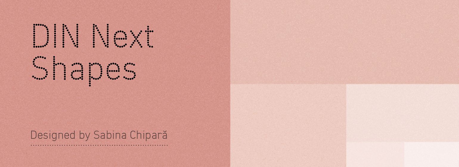
DIN® Next Shapes
字体介绍:
DIN Next Shapes提供了圆点、雪花、心形和星星四种字体——Chipara的设计为严谨的工业设计做了一些修饰。DIN Next Shapes保留了DIN Next的易读性——利用了其悠久的工业使用历史——但更加通用。
“DIN Next显然是机械绘制的,因此风格非常强健,而DIN Next Shapes严谨的结构在某种程度上变得更有趣,因此它可以用于非常不同的目的,”Chipara说。
该字体用途广泛,特别适用于品牌推广。在设计师需要增加趣味性的环境中,它可以作为DIN Next的一个补充,并且还适用于logo或标识。它甚至可以被尝试,可能在动图像中使用,或者与DIN Next交替使用。
DIN Next Shapes提供泛欧语言支持,包括希腊语和西里尔语,并提供OpenType功能,包括风格选择、连字和分数。
Sabina Chipara stripped DIN Next back to its basic elements and re-clothed it, for this playful spin on the sturdy sans serif. DIN Next Shapes embodies all the same industrial character and reliable legibility as the original, but with a totally different tone of voice – perfect for designers that want a more expressive version of DIN Next.
Available in four fonts – Dots, Flakes, Hearts and Stars – Chipara's design adds some extra embroidery to a strictly industrial design. DIN Next Shapes retains the legibility and instancy of DIN Next – which draws on a lengthy history of industrial usage – but adds greater versatility.
“DIN Next is obviously mechanically drawn, so the voice is very solid, but with DIN Next Shapes its rigid structure becomes much more playful in a way, so it could be used for very different purposes,” says Chipara. a
The typeface fits a wide range of uses, and is particularly suitable for branding. It can work as a complimentary counterpart for DIN Next in environments where designers need to add playfulness, and would also lend itself to logos or identities. It even opens itself up to experimentation, perhaps in moving image or used interchangeably with DIN Next.
DIN Next Shapes offers pan European language support, including Greek and Cyrillic, and offers OpenType features including stylistic alternatives, ligatures and fractions.








 商业发布授权
 出版物授权:针对出版物
 嵌入式应用授权


