Copperplate Gothic
I would prefer as friend a good man ignorant than one more clever who is evil too.
字体介绍:
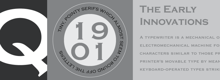
Copperplate Gothic was designed by Frederic Goudy and cut by American Type Founders circa 1901. These capital only fonts are basically monotone but have small nib serifs that give the feeling of the engravers tool. Originally designed for use on business cards, letterheads and stationery, the Copperplate Gothic font family now has a wider appeal in advertising and magazine production. The AB and BC names refer to the size relationship of capitals and small capitals.








 商业发布授权
 出版物授权:针对出版物
 嵌入式应用授权


