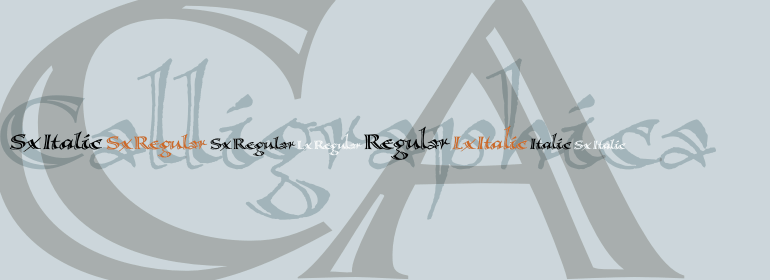
Calligraphica™
Why, I'd like nothing better than to achieve some bold adventure, worthy of our trip.
字体介绍:
Calligraphica家族包含6种字体:Calligraphica Regular和Italic是常规的、垂直的罗马真斜体版本。该字体的上伸部比大写字母高一点——这是大多数字体的标准。Calligraphica LX Regular和Italic与前两种字体相似,不同之处在于它们的上伸部更长,并且比大写字母高——使这些字体看起来更高。Calligraphica SX Regular和Italic与前两种字体相似,不同之处在于它们的上伸部较短且与大写字母高度相同——使这些字体看起来更短。
Calligraphica was designed because there are very few inline fonts, and even fewer inline calligraphic fonts. The original forms were written with a split pen in a single stroke. The minuscules have a rougher look and the capitals have a smoother shape to imitate hand written calligraphy with more formal, decorative initial caps.
The Calligraphica family contains 6 fonts: Calligraphica Regular and Italic are the regular upright roman true italic version of the font. The ascenders on this font are a bit higher than the capital letters--this is standard for most fonts. Calligraphica LX Regular and Italic are similar to the first 2 fonts except their ascenders are longer and reach high above the capital letters--giving these fonts a taller appearance. Calligraphica SX Regular and Italic are similar to the first 2 fonts except their ascenders are shorter and are the same height as the capital letters--giving these fonts a shorter appearance.









 商业发布授权
 出版物授权:针对出版物
 嵌入式应用授权


