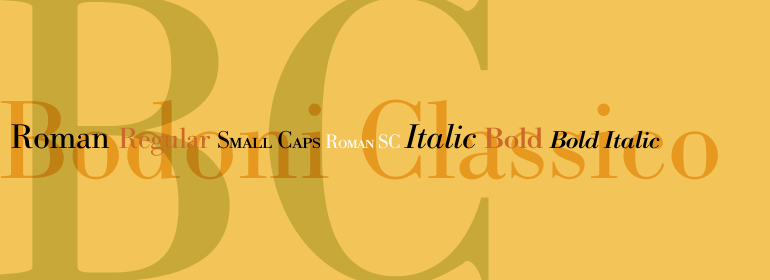
Bodoni Classico™
The spoken word is man's physician in grief. For this alone has soothing charms for the soul.
字体介绍:
现代风格字体代表了18世纪末和19世纪初排印的最终发展。它们的特征与之前的字体截然不同;比如,极端的垂直应力,精细的极细线与粗的主笔画之间形成了鲜明对比,以及非常微妙的、几乎不存在的清晰界定的极细衬线。
Bodoni将这种风格看作是美丽和谐的,用精良之笔书写的自然结果,外观时尚且令人赞叹。 其他的字体设计师,如法国的Didot家族(1689-1853)以及德国的J. E. Walbaum(1768-1839)也都制作了自己的现代风格字体。
尽管一些19世纪的批评家们对此嗤之以鼻,称这种字体是破碎的,冷酷的,但今天人们对Bodoni现代风格字体的看法与他所处的时代大体相同。如果使用慎重,Bodoni字体既浪漫又优雅,能为标题和广告增添高雅的活力。
与其他版本的Bodoni字体相比,Franko Luin的Bodoni Classico™的细笔划更粗。这些笔画在较小尺寸下表现不错,使这个字体家族成为文本或字幕的理想之选。
Giambattista Bodoni (1740-1813) was called the King of Printers; he was a prolific type designer, a masterful engraver of punches and the most widely admired printer of his time. His books and typefaces were created during the 45 years he was the director of the fine press and publishing house of the Duke of Parma in Italy. He produced the best of what are known as modern" style types, basing them on the finest writing of his time. Modern types represented the ultimate typographic development of the late eighteenth and early nineteenth centuries. They have characteristics quite different from the types that preceded them; such as extreme vertical stress, fine hairlines contrasted by bold main strokes, and very subtle, almost non-existent bracketing of sharply defined hairline serifs. Bodoni saw this style as beautiful and harmonious-the natural result of writing done with a well-cut pen, and the look was fashionable and admired. Other punchcutters, such as the Didot family (1689-1853) in France, and J. E. Walbaum (1768-1839) in Germany made their own versions of the modern faces. Even though some nineteenth century critics turned up their noses and called such types shattering and chilly, today the Bodoni moderns are seen in much the same light as they were in his own time. When used with care, the Bodoni types are both romantic and elegant, with a presence that adds tasteful sparkle to headlines and advertising.
Franko Luin's Bodoni Classico™ has thicker thin strokes than other versions of Bodoni. These strokes hold up well at smaller point sizes, making this family a good choice for text or captions."







 商业发布授权
 出版物授权:针对出版物
 嵌入式应用授权


