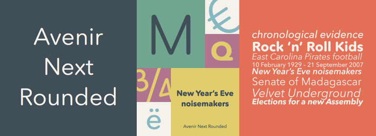
Avenir® Next Rounded
字体介绍:
Adrian Frutiger designed Avenir™ in 1988, after years of having an interest in sans serif typefaces. In an interview with Linotype, he said he felt an obligation to design a linear sans in the tradition of Erbar and Futura, but to also make use of the experience and stylistic developments of the twentieth century. The word Avenir means 'future' in French and hints that the typeface owes some of its interpretation to Futura. But unlike Futura, Avenir is not purely geometric; it has vertical strokes that are thicker than the horizontals, an """"o"""" that is not a perfect circle, and shortened ascenders. These nuances aid in legibility and give Avenir a harmonious and sensible appearance for both texts and headlines. Avenir™ Next is a Platinum Collectionfont family, recently released as a major improvement and extension to the existing Avenir. It includes new small caps, newly designed true italics, and a complete new range of condensed weights. Avenir™ Next is a versatile sans serif family, ready for large and complex projects from books to signage to advertising.










 商业发布授权
 出版物授权:针对出版物
 嵌入式应用授权


