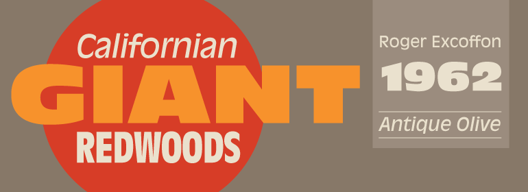
Antique Olive™
Whoso neglects learning in his youth, loses the past and is dead for the future.
字体介绍:
Antique Olive具有很高的x高度和开放字母形状,因此非常易于阅读,是较小尺寸的理想之选。
Antique Olive has been designed by the famous french type designer Roger Excoffon. In 1960 he first designed the Nord and Nord italic. Which perfectly fits for advertising, signage and poster purposes. The Bold and Compact weights had been designes in 1963. Later in 1965 the Black weight was released. Finally in 1968 the Bold Condensed and in 1969 the Roman and iIalic weights had been released.
Antique Olive has a very large x-height and open letterforms, therefore it is very readable and ideal for smaller point sizes.












 商业发布授权
 出版物授权:针对出版物
 嵌入式应用授权


