Vectora®
字体介绍:
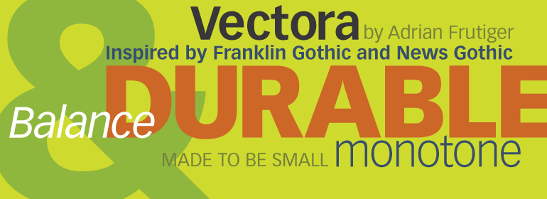
Adrian Frutiger designed Vectora for Linotype in 1990, after realizing there was need for a sans serif type that could be read easily at small sizes . He was influenced by the sans serif types designed by Morris Fuller Benton in the early 1900s for American Type Founders, such as Franklin Gothic and News Gothic. Vectora has a visually balanced monotone appearance, tall x-heights, taut individual shapes, and open counterspaces - all characteristics that aid in legibility at small sizes. Frutiger also built in design consistency to all the weights and styles to create a harmonious and functional family. When a contemporary sans serif is appropriate for text typography, Vectora provides a practical choice.









 商业发布授权
 出版物授权:针对出版物
 嵌入式应用授权


