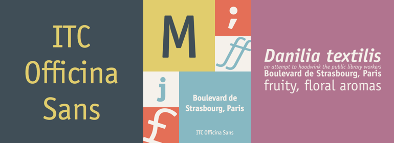
ITC Officina® Sans
字体介绍:
但是除了通信,它在其他很多领域都很受欢迎。ITC Officina的设计师Erik Spiekermann说:“一旦ITC Officina被潮流引领者选中用以表示‘酷’,它就失去了纯真。不用再假装它只需要两个用于办公室通信的字重。作为杂志和广告使用的字体,它需要合适的标题字重,需要在Book和Bold之间再加一个字重。”为了增加新的字重和小型大写字母,Spiekermann与MetaDesign的排版及字体设计总监Ole Schaefer合作。如今扩展后的ITC Officina家族无论是衬线体还是无衬线体,都包括Medium, Extra Bold, 以及Black及其相应的斜体——以及原始Book和Bold字重中新的小型大写字母。
When ITC Officina was first released in 1990, as a paired family of serif and sans serif faces in two weights with italics, it was intended as a workhorse typeface for business correspondence. But the typeface proved popular in many more areas than correspondence. Erik Spiekermann, ITC Officina's designer: Once ITC Officina got picked up by the trendsetters to denote 'coolness,' it had lost its innocence. No pretending anymore that it only needed two weights for office correspondence. As a face used in magazines and advertising, it needed proper headline weights and one more weight in between the original Book and Bold."" To add the new weights and small caps, Spiekermann collaborated with Ole Schaefer, director of typography and type design at MetaDesign. The extended ITC Officina family now includes Medium, Extra Bold, and Black weights with matching italics-all in both Sans and Serif -- as well as new small caps fonts for the original Book and Bold weights.






 商业发布授权
 出版物授权:针对出版物
 嵌入式应用授权


