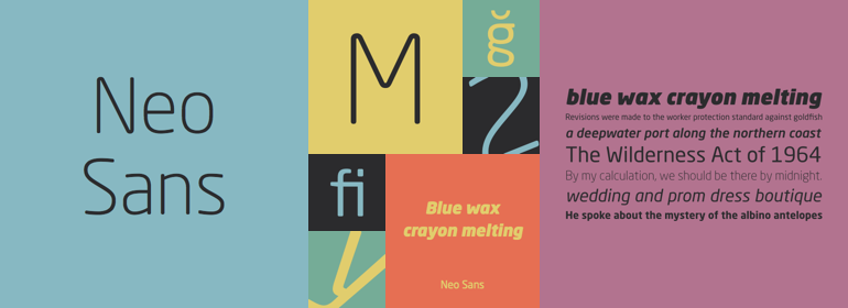
Neo® Sans
字体介绍:
Lester说:“我留下了一本满是想法的草图本,我想,如果不看看这些想法被设计出来后的效果,那太遗憾了。”他决定自己完成设计。
Lester的研究证实,“超现代”字体的关键是字符结构的简单性:精心绘制的单线格式、开放的字母形状和平滑有力的曲线。为了构思一种从现代跨越到未来的字体,Lester决定将这些特质加以放大。
在Lester最初的概念设计工作完成大约一年后,两种功能强大、用途广泛的字体出现了。它们是Neo Sans和Neo Tech,Lester将其设计描述为“清晰而不中性,细致而不繁琐,具备表现力却又不分散注意力”。
Neo Sans和更简约的Neo Tech家族都有从Light到Ultra六种字重可供选择。每一种字重都有其对应的斜体字,Neo Tech还提供了一套替换字符。
尽管Neo Sans和Neo Tech的设计看起来像明天一样现代,但它们在功能和美学上的卓越表现,使它们在Monotype字体库的经典设计列表中占有一席之地。”
The branding agency's client wanted an ultra modern" typeface that was "futuristic without being gimmicky or ephemeral," according to the design brief. Designer Sebastian Lester took on this intriguing custom font assignment, but soon, a bureaucratic decision cancelled the project.
"I was left with a sketchbook full of ideas and thought it would be a shame not to see what came of them," says Lester. He decided to finish the design on his own.
Lester's research confirmed that the principal ingredient of an "ultra modern" typeface was simplicity of character structure: a carefully drawn, monoline form, open letter shapes and smooth, strong curves. To conceive a typeface that crossed the line from modern to futuristic, Lester decided to amplify these qualities.
About a year after Lester's initial conceptual work, two highly functional and versatile typefaces emerged. These are Neo Sans and Neo Tech, designs Lester describes as "legible without being neutral, nuanced without being fussy, and expressive without being distracting."
Both the Neo Sans and the more-minimalist Neo Tech families are available in six weights, ranging from Light to Ultra. Each has a companion italic, and Neo Tech offers a suite of alternate characters.
While engineered to look modern as tomorrow, Neo Sans and Neo Tech display the functional and aesthetic excellence that earns them a place in the list of classic designs from the Monotype typeface library."







 商业发布授权
 出版物授权:针对出版物
 嵌入式应用授权


